Katsby Campus
Landing pageI made an investment simulation game for elementary students that schools actually use in class, plus a teacher platform to run the game.
- Role
- Solo Product Designer (Contract)
- Team
- Web Developer, Designer (Me), Content Editor
- Year
- Mar – Jun 2026
- Skills
- Project planning, UX research, Product design, start to finish, Design systems, UI design
The core first
I designed a new way to teach kids financial decision-making through play
As a contract solo designer at Katsby, I designed Katsby Campus from the first brief to the classroom: a stock-market simulation for elementary schoolers.
Problem
Most kids meet money as something abstract, with no way to practice real decisions against a living market.
Strategy
A premium classroom program: mock investing on real market data, curriculum drawn from global economic media, and expert literacy reports that make each child’s thinking visible.
Impact
- Korea’s first youth financial-decision program
- Implemented in 5+ international schools and elementary schools in Korea
Overview
How to turn kids who ask to buy an iPhone into kids who want to buy stocks
Katsby Campus is a stock-market simulation for elementary schoolers. I designed it twice. V1 was for younger students. V2 was a full redesign once real classrooms showed what the first version couldn’t hold.
Problem
In an AI era, kids still need financial self-defense
From math to coding to AI, kids keep learning new tools, but not how to think strategically. What they need now is the ability to select the right information and communicate with clear logic.
Solution
What if elementary students learn finance through English class?
The first version proved the concept, but classroom use exposed three issues: a confusing buy/sell flow, a visual style that read as too childish for older kids, and portfolio data that was hard to reach when students needed it most.
V2 rebuilt the buy/sell flow into a clearer, more direct path, matured the visual language so it respected older students, and put portfolio status on every screen, never more than a glance away.
Campus dashboard
Campus dashboard
V2 trading surface with calmer visuals and portfolio status on every screen, never more than a glance away.
Core Flows
Making value make sense
Kids don't arrive with financial literacy, so 'company value' is abstract. I introduced a revenue metaphor that grounds the idea in something they already know, so they can feel why a company is worth more or less without a vocabulary lesson first.
Mini quiz
Mini quiz
A short check that connects classroom play to why a company is worth more or less, without a vocabulary lecture first.
Research
From login to landing page
Because it ships into real classrooms, the experience had to hold up from the first second to the business case behind it. I designed the QR login, the waiting room, the unskippable onboarding, the team game loop, the rewards, and the landing page that sells it.
Waiting room
Waiting room
Keeps the class synced before the game starts.
3-step onboarding
3-step onboarding
Unskippable modal that orients every student before play.
Team-based game loop
Team-based game loop
Collaborative rounds that mirror real market dynamics.
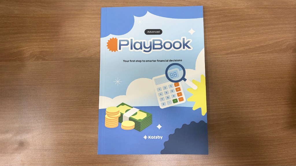
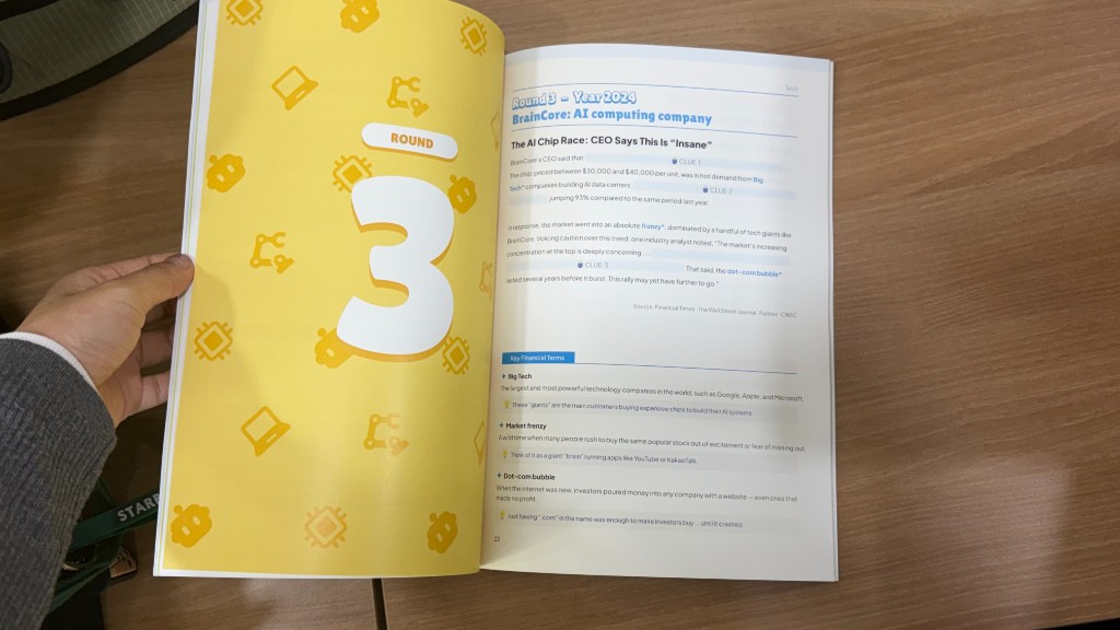
PlayBook
PlayBook
Curriculum spreads that ground each round in real economic media and key terms.
Round results
Round results
Post-round outcomes that make market moves visible to the whole class.
Learnings & Impact
What shipping twice into real classrooms taught me
Classroom reality beats the first brief
V1 proved the concept, but live classrooms showed the real product. Designing again from that evidence, not from guesses, is what made V2 hold up for older students and tighter class periods.
Visual tone is an age decision
A cute visual language won younger kids and lost older ones. Maturing the UI without losing playfulness taught me that “for kids” is not one look. Different ages need different respect.
Put critical data where decisions happen
Students needed to see their portfolio while deciding, not three taps away. The side panel came from watching them get stuck. Putting the numbers where the choice happens was the requirement, not a nice-to-have.
Explore other projects